A peek behind the scenes this week.
Last week I printed up a new design. If you follow me on Instagram or Facebook you may have seen it. I want to share the steps this design took along its way to the fabric – and finally into a product.
This design was conceived, as many of them are, on our summer break away at the beach house. I have so much more time when we are away just to dream, doodle, draw and design at my leisure. The weeks when we are home and working, I seem to have less time for actually designing than when I am on holiday. In actual fact, designing is maybe my favourite part of the whole process but there are, of course, a whole lot of other things I need to do in my one woman show!
Anyway, back to that afternoon on the deck at the beach house. I was alternately doodling/sketching and flipping through the latest House & Garden magazine I had bought to bring with me (another thing I don’t seem to have much time for at home – flipping through my home/interior design mags). I came across this photo of a bedroom rug.
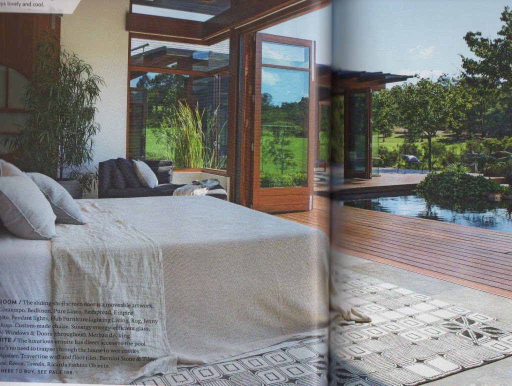
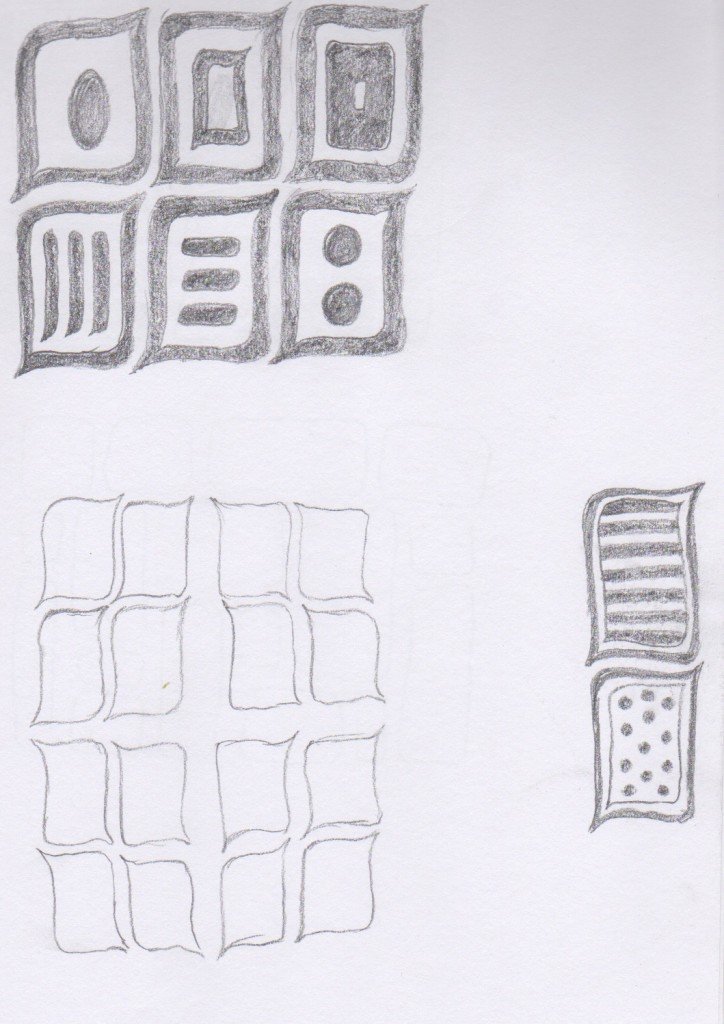
Something about the graphic quality and shape caught my attention and I started to doodle again. I didn’t draw much – you can see the page here – and what I drew wasn’t exactly what I saw in the picture but it was the kernel of an idea that I filed away for later.
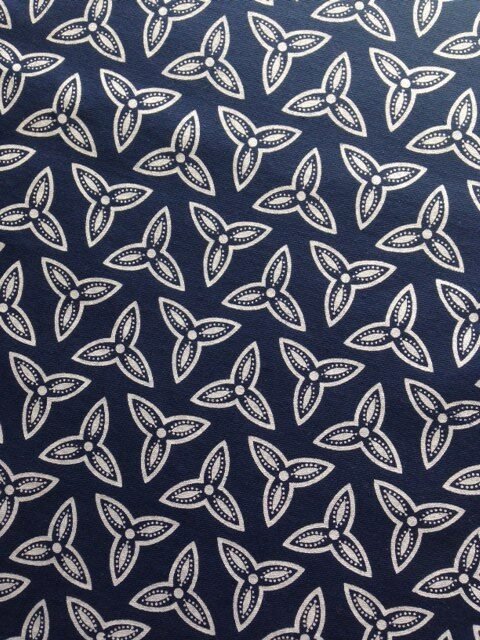
Later came just a week or two later when I was thinking I would like a new print to coordinate with this Trefoil design (which, you guessed it, was conceived in the same location a year earlier!)
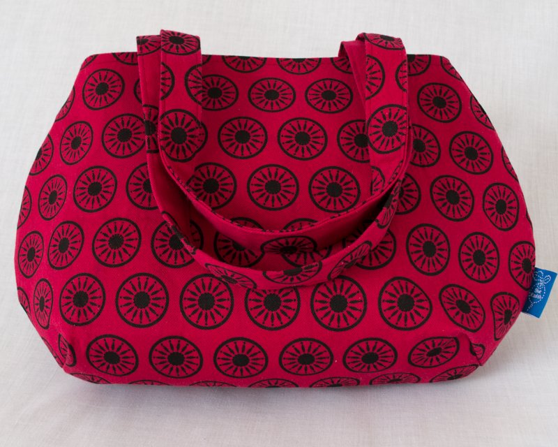
I really like this design and had a lot of positive comments about it but I wasn’t as keen on the print I had created to complement it (the Scandi Flower – seen in the picture on a handbag).
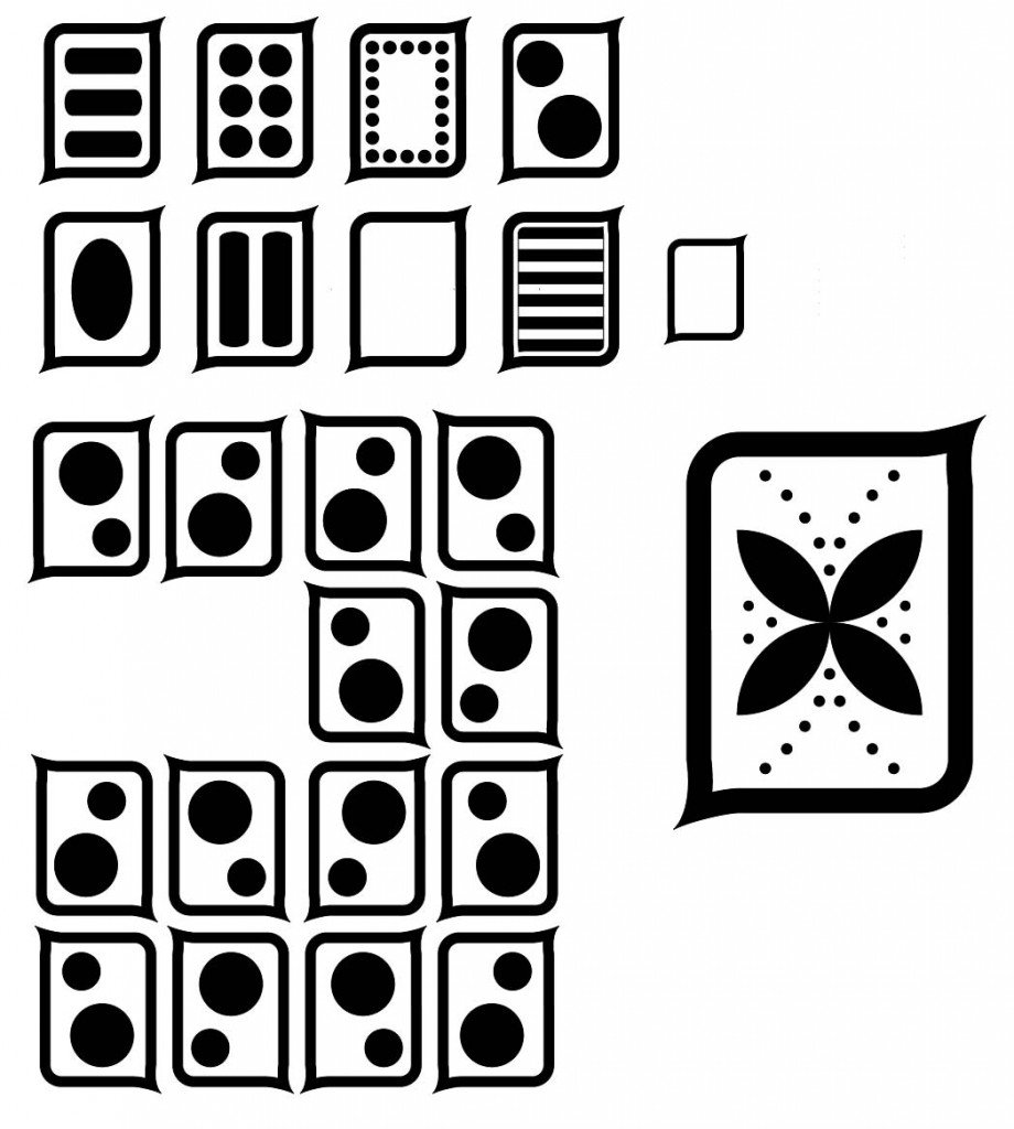
That shape came back to me and I opened up Adobe Illustrator to start playing with it.
I played with some of the ‘icons’ I had sketched but they all felt too heavy for the Trefoil design. So I reflected the Trefoil leaf (or petal) shape in the new design as a ‘quadfoil’ which began to look a lot like a flower. Then I took the small dot idea of Trefoil and incorporated it into the new shape. There was a lot of playing around with size and the positioning of the dots at this point until I settled on something that I found pleasing. This became my Flower Tile.
Flower Tile then needed to be put into repeat. A simple repeat of the tile was pretty bland but the stretched out corners lent themselves to a group of four, as I had sketched that the beach, so I played around with different ways to put them together and with how far from each other the tiles would be. This stage is largely trial and error and ‘eye-balling’ what I think looks balanced and harmonious.
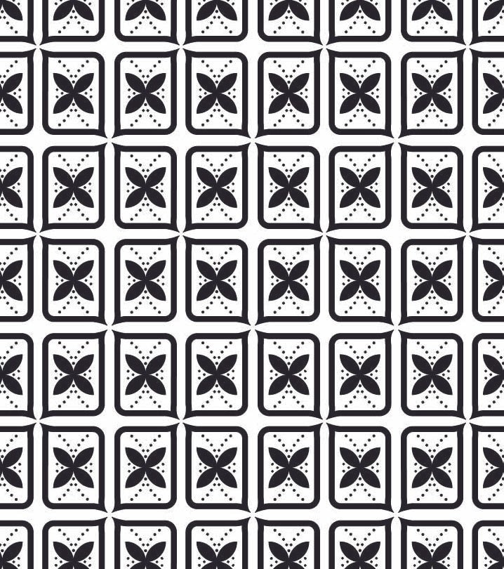
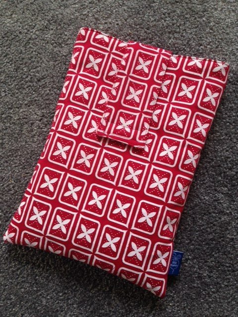
The result of this playing around in Illustrator was the Flower Tile repeat shown here which I printed out and used as my image positive to expose onto my screen (a process I have described in this post). Once the image was on my screen, I was ready to print and this is the result of its first run.
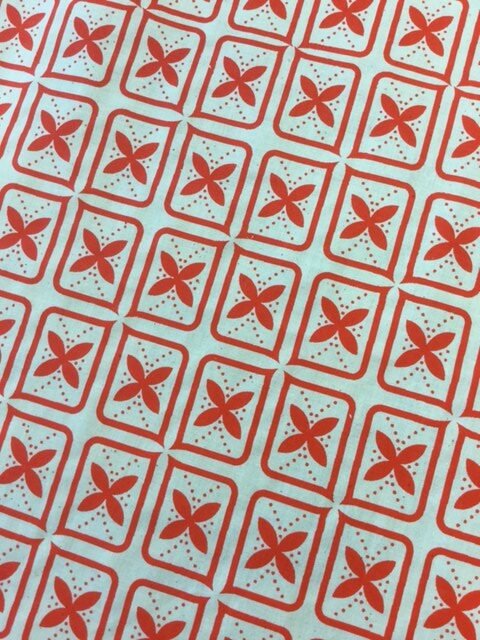
I have to say I’m pretty pleased with how it has turned out. I just had a customer on Etsy order a laptop sleeve in this design in red so I hope that is a sign that this is a design that people will like. What do you think?